Overview /
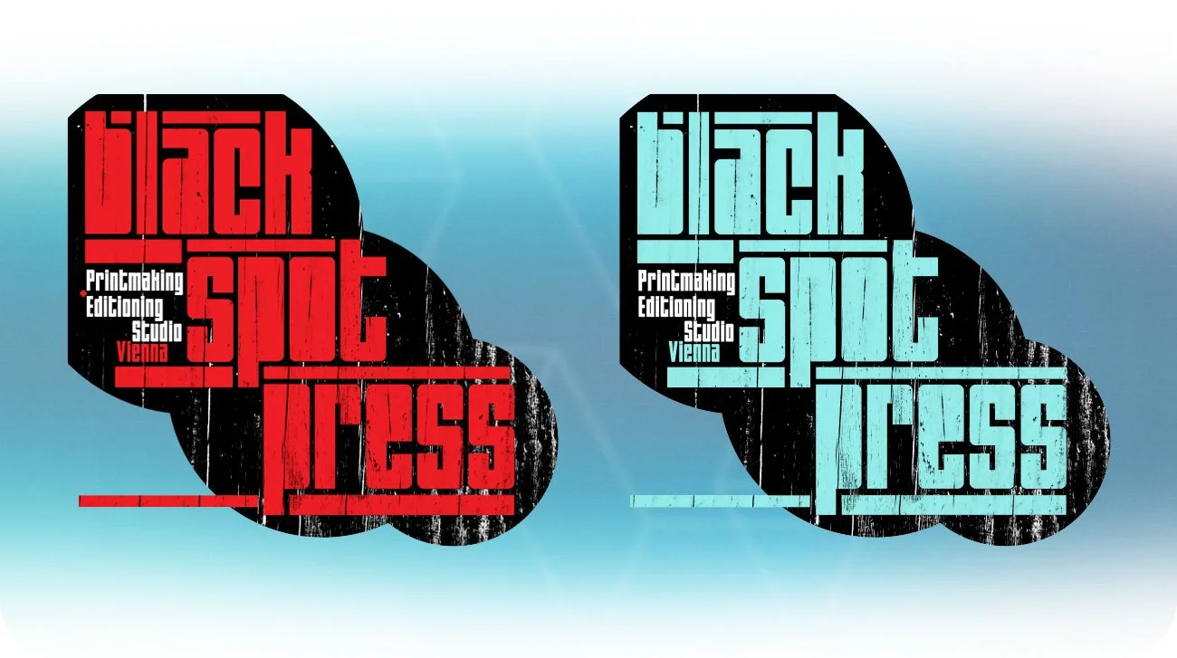
Black Spot Press is a Vienna-based fine art print studio situated at the intersection of traditional craft and experimental mark-making. The strategic requirement was an identity that resonated with artists and collaborators who value materiality and the physicality of print, whilst positioning the studio as a contemporary and distinctive voice in the sector.
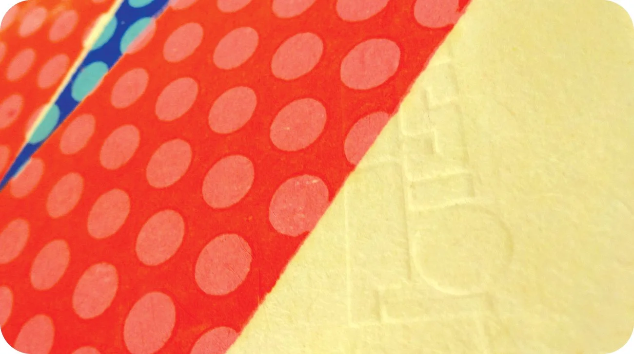
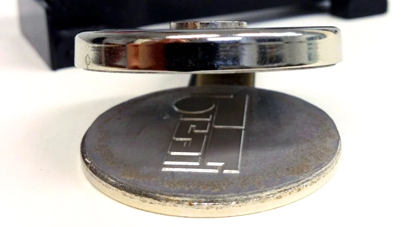
The challenge lay in creating a brand that felt as tactile as the work produced; rather than adopting a polished, corporate aesthetic, the system was built from the language of ink, pressure, and handmade marks to remain authentic to the art print community.
Role /
Creative direction and lead for systemic identity design. Responsible for translating the studio’s printmaking ethos into a cohesive visual language, shaping how the press presents itself to artists, collaborators, and collectors through logo design, typography, and a modular graphic framework.
Brief /
The development of a distinctive brand identity for Black Spot Press on behalf of Irish master printer Tom Phelan. The framework needed to reflect a deep respect for traditional fine art techniques whilst capturing an experimental, independent, and artist-led spirit.
The identity required credibility within the fine art world, deliberately avoiding corporate polish to preserve the raw, "gritty" energy that defines the studio’s output.