Overview /
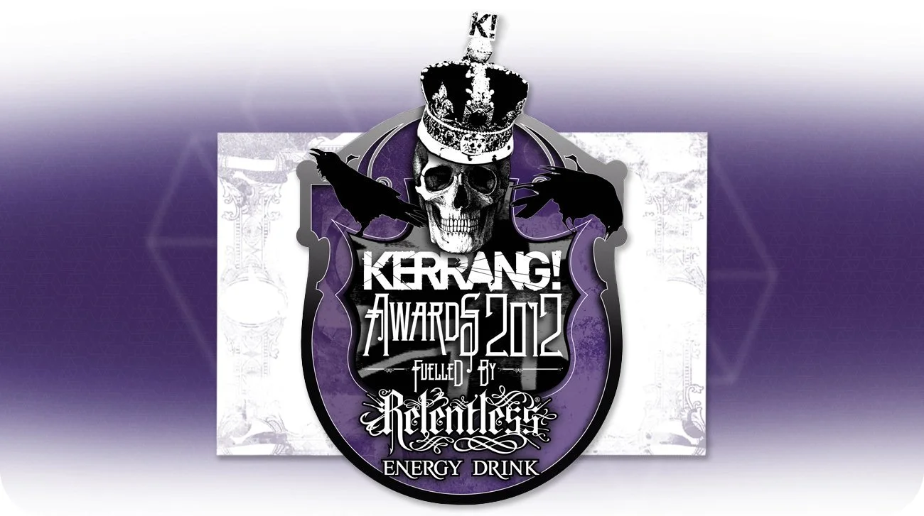
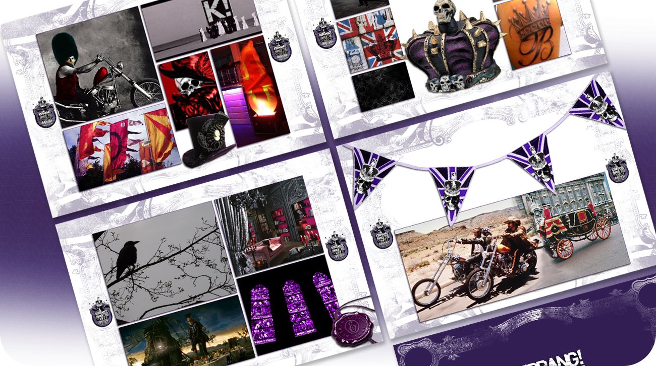
The Kerrang! Awards represent a high-stakes intersection of music subculture, spectacle, and national narrative. This edition required the hijacking of royal ceremonial visual archetypes, subverting them through an anarchic rock lens to coincide with the Diamond Jubilee.
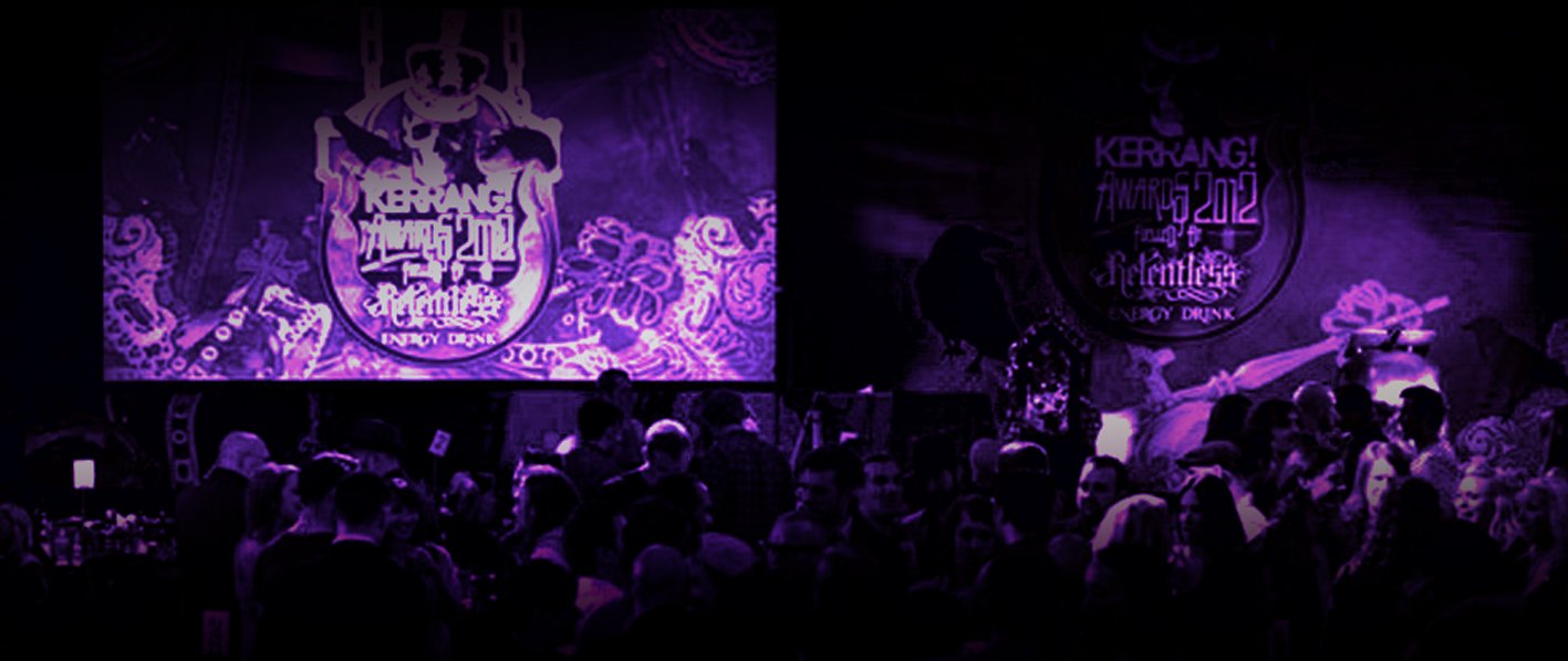
The strategic challenge lay in balancing subversive parody with institutional power, ensuring the identity delivered the scale and credibility required for a major national broadcast and awards ceremony.
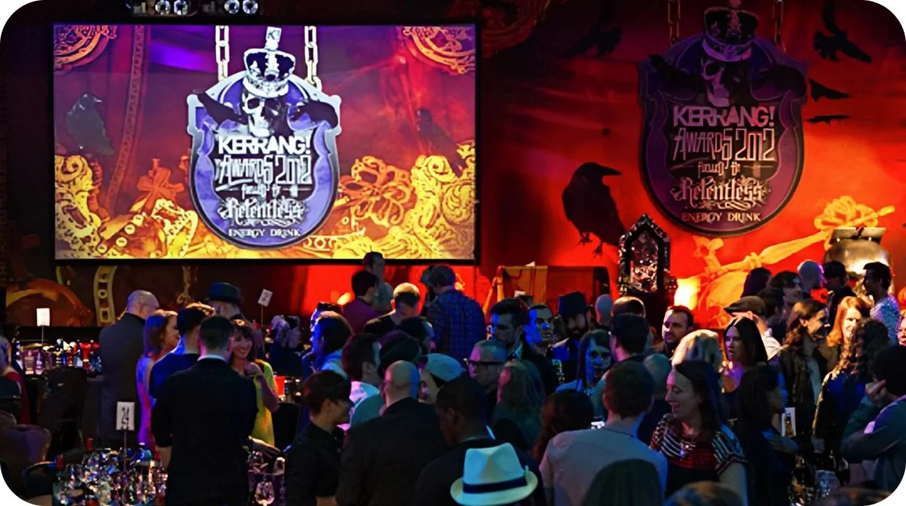
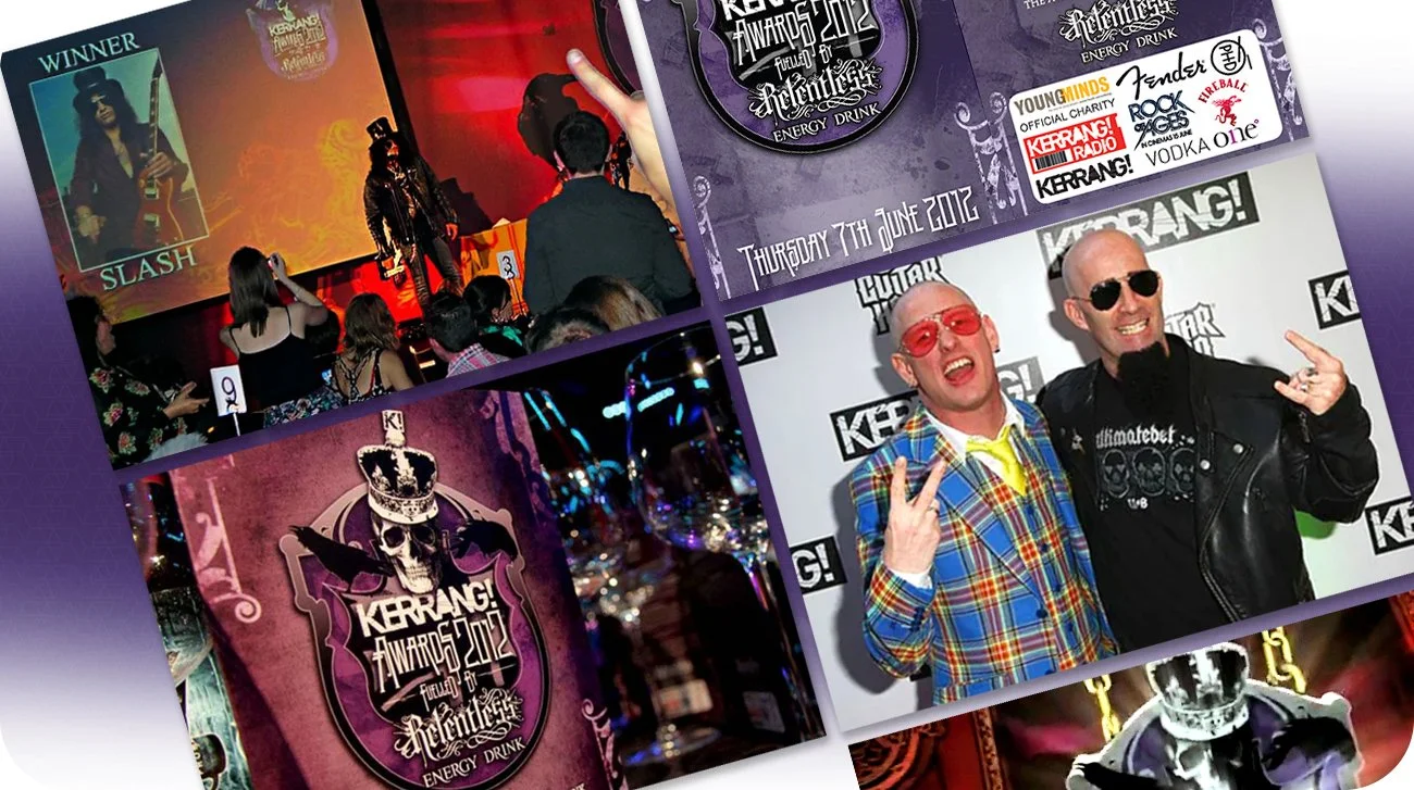
The resulting gothic-regal system fused heraldry with raw energy to create a comprehensive, atmospheric world across all digital and physical environments.
Role /
Creative direction and identity orchestration across all campaign, environment, and live production touchpoints. Responsibilities included the development of the core brand architecture and the engineering of a full visual system capable of scaling from initial teaser graphics to large-format physical stage environments.
Oversight included the rollout across print, digital, motion, and on-site branding, defining the end-to-end user experience of the event.
Brief /
The development of an integrated awards identity that subverted Diamond Jubilee imagery through a punk and rock lens. The framework needed to remain bold and theatrical while functioning as a coherent campaign system across pre-event promotion, venue environment, and live production.