Overview /
Creative and editorial design leadership across The Week Junior and its parent title The Week, managing two distinct news ecosystems for differing user mental models.
Both titles rely on absolute clarity and trusted editorial voices, where the design architecture serves as the primary tool for credibility and cognitive accessibility.
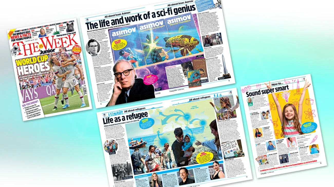
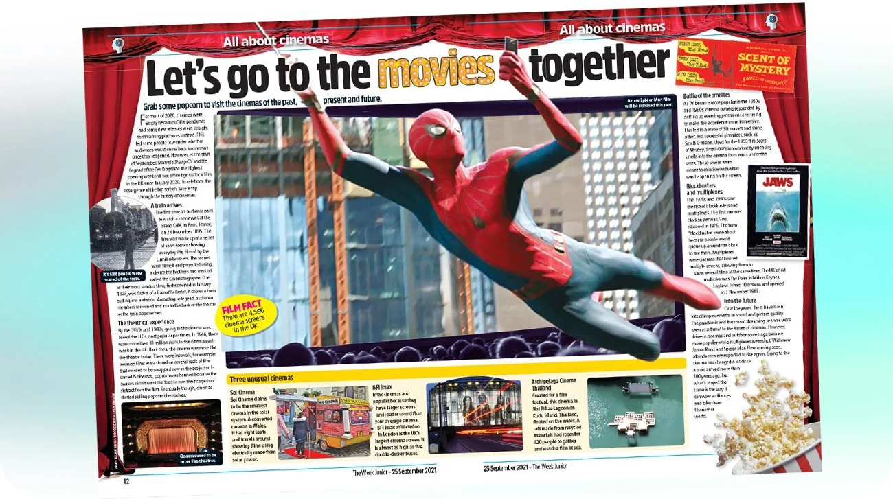
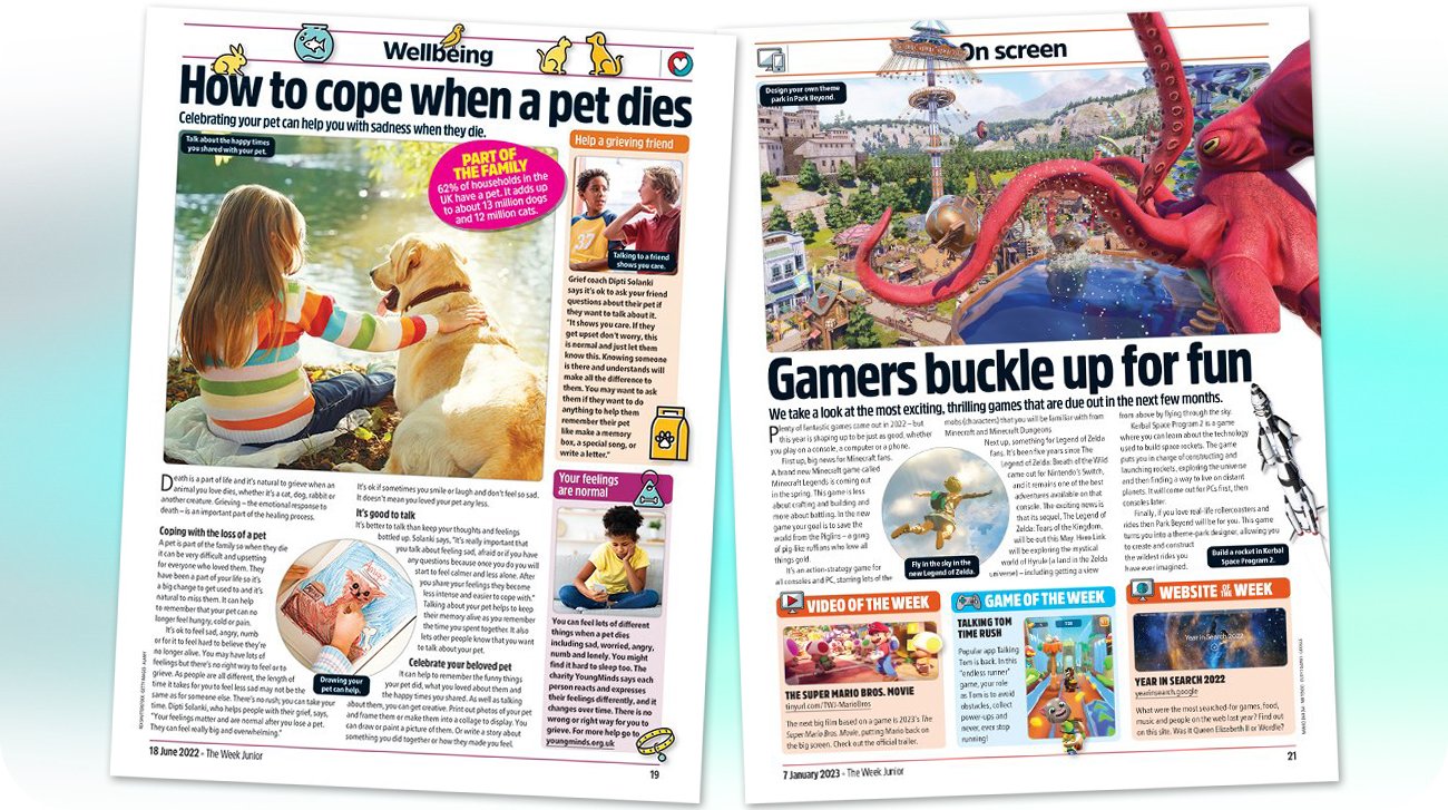
For The Week Junior, the focus is on Cognitive Scaffolding: making complex global events navigable and reassuring for young minds without overwhelming the reader.
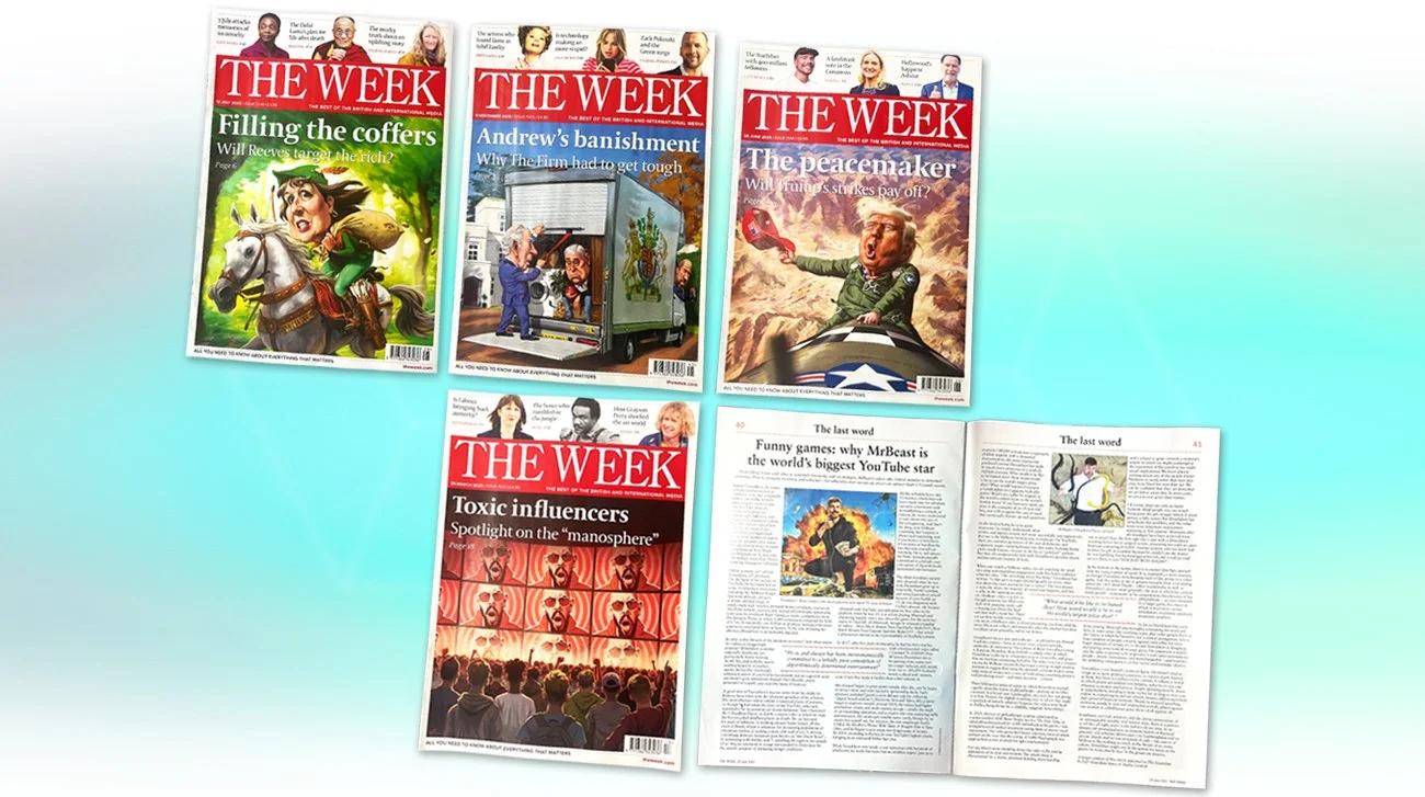
For The Week, the emphasis shifts to Information Density and Hierarchy, presenting global politics in a high-speed, structured format that respects the cognitive pace of an adult audience.
Role /
Lead Systems Architect and Art Director across print issues, features, and multi-platform visual storytelling systems. Responsibilities include establishing Information Architecture (IA), typographic systems, and cross-functional leadership, collaborating with editors and writers to ensure absolute alignment between complex global narratives and audience psychology.
Brief /
The Week Junior
To engineer a calm, trustworthy news environment for readers aged 8–14 that simplifies high-friction topics without oversimplification, balancing editorial authority with high-engagement visual cues.
The Week
To provide a concise, structured information system for time-poor users, supporting rapid comprehension and clear hierarchy for dense global news and politics.